Large Selection of Charts and User Interface Objects
Flare BI provides a large set of charts and user interface objects. Below is a partial list:
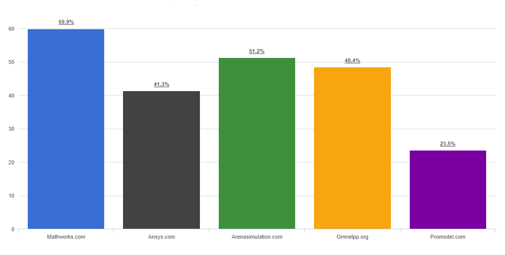
Bar Chart
Standard bar chart with labels, tool tips and drill down. Colors can be static or dynamically
assigned based on variables or expressions. Bar charts can also have a horizontal scroll bar added.
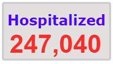
KPI Box
KPI boxes can contain images and/or text. Text can be static or conditional based on variables and expressions. KPI boxes like all Flare
UI objects can be layered on top of each other making it possible to build more pleasing user interfaces.
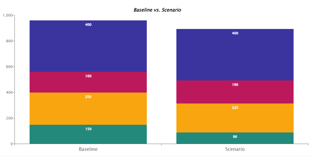
Stacked Bar Chart
Stacked bar chart with labels, tool tips and drill down. Colors can be static or dynamically
assigned based on variables or expressions. Bar charts can also have a horizontal scroll bar added.
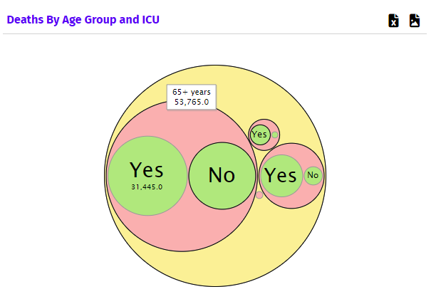
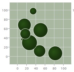
Bubble Pack Chart
Bubble Pack Charts are great for showing the relationship between a few
number of dimensions when the differences between them are significant.
Panels
Panels allow you to place user interface objects that are grouped together and are only visible when the panel is open.
Panels can be used to group UI objects together
in blocks or as modal dialog boxes that can be opened and closed. This allows for creating more pleasurable user experience.
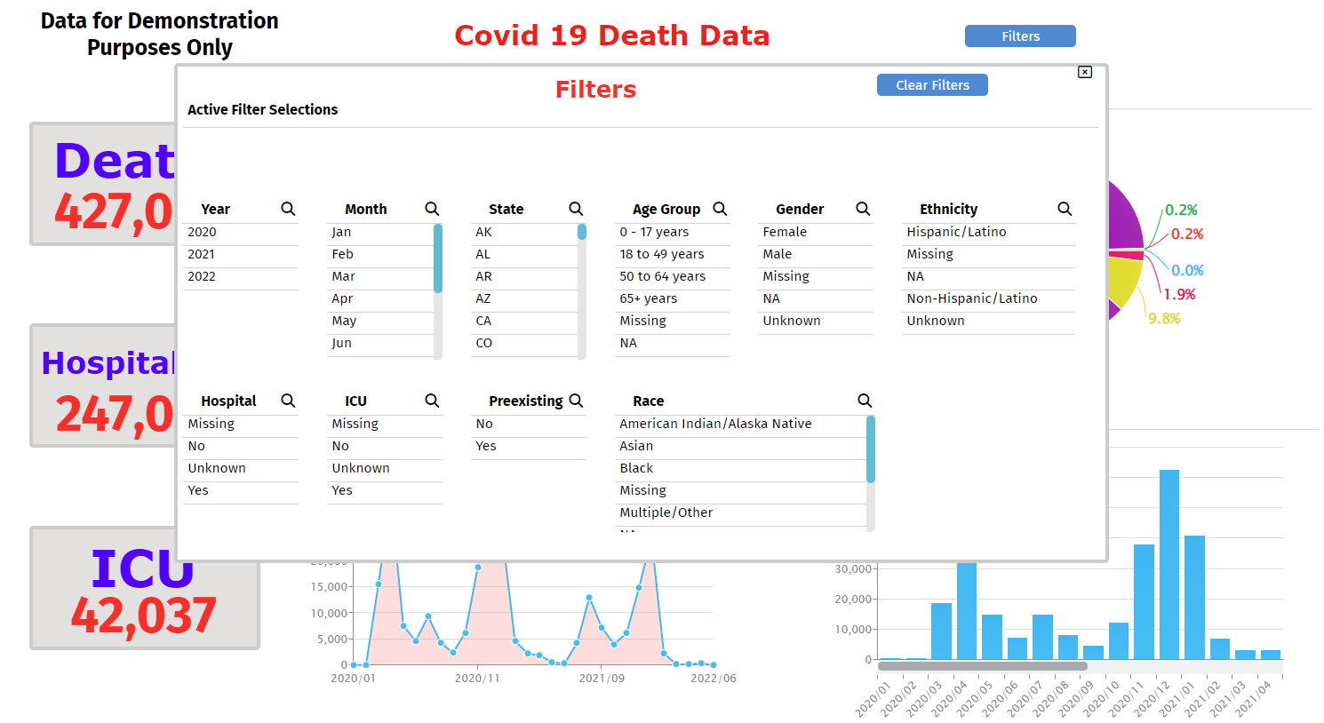
Selection Filters
Selection filters allows a user to filter the data.
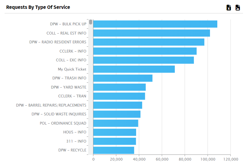
Horizontal Bar Chart
Horizontal bar chart with labels, tool tips and drill down.
Colors can be static or dynamically assigned based on variables or expressions.
Bar charts can also have scrolling x axis.

Buttons
Buttons are used to create a dynamic user interface experience.
Buttons can be used to hide a show other user interface objects like charts and panels.
They can also be used to trigger various actions such as setting filters,
clearing filters, calling specialized functions, changing the value of variables etc.
Area Chart
Classic Area chart with lots of properties to control axis labels, colors and formatting.
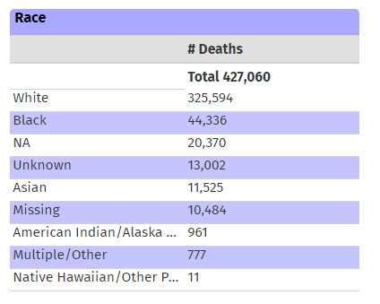
Table
A Table is used to display data in a tabular way.
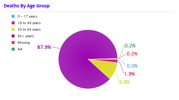
Pie Chart
Classic Pie chart with legend and labels outside the pie.
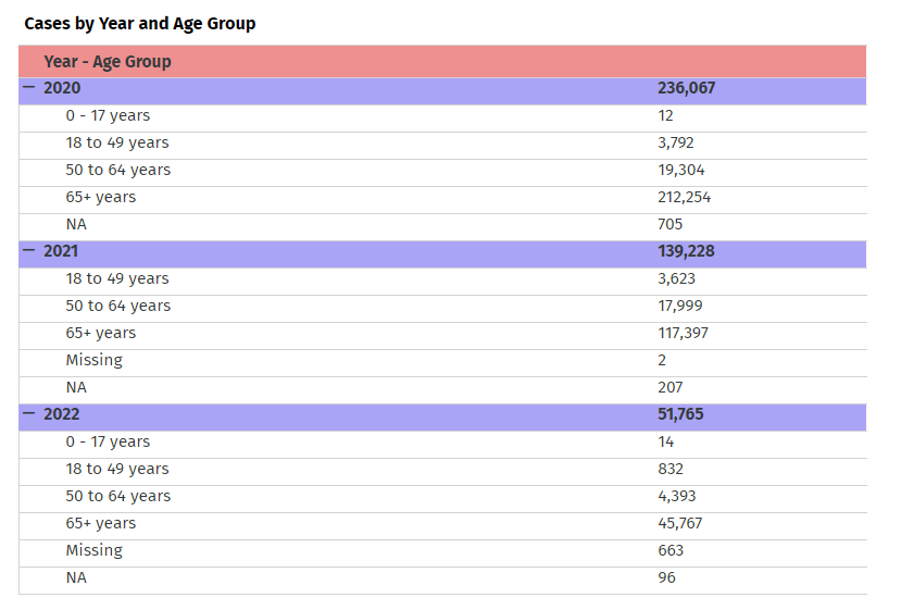
Pivot Table
Pivot Tables are useful in visualizing tabular data that is hierarchical in nature.
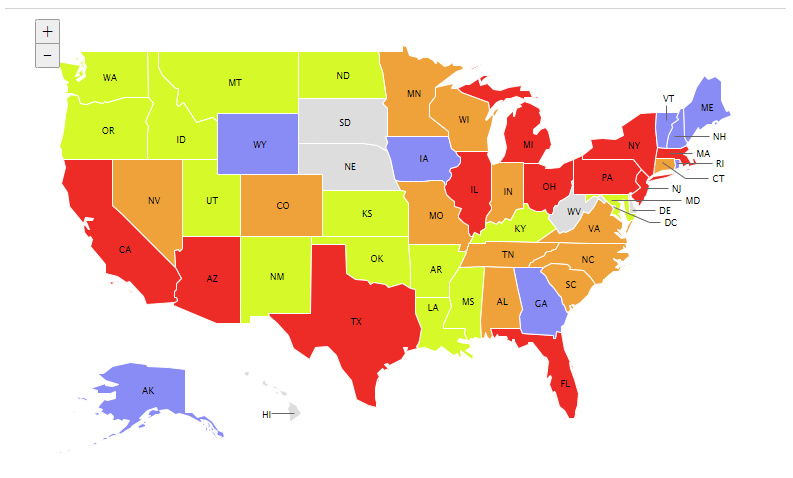
US and World Maps
Map shading can be used to visualize data that is geographic in nature.
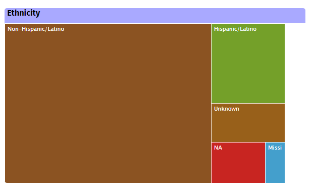
Tree Map Chart
Classic Tree Map Chart is useful for showing nested hierarchy within data.
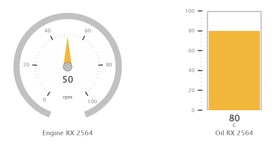
Gauges
Various Gauges to display single value KPIs
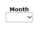
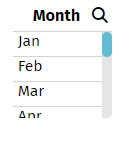
Drop Down Filter
Like the Selection Filter it allows the user to filter the data.
It is much more compact than the selection filter making it useful when many filters are needed.
Bubble Chart
Classic Bubble Chart - useful when needing to show data based on 3 dimensions (X, Y, Z)
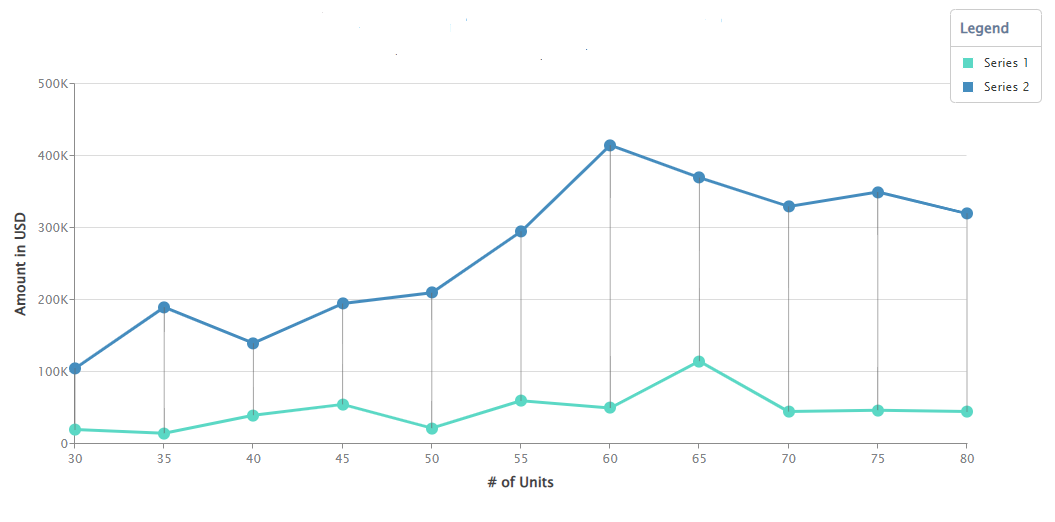
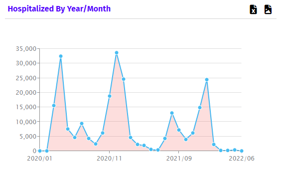
Line Chart
Classic Line Chart - useful for showing data over time periods
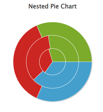
Nested Pie Chart
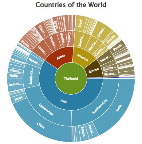
Sunburst Chart
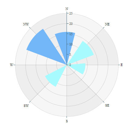
Radar Chart